Blog
Wren’s new logo
The story of our logo, and it’s development, can only be understood by knowing where we started…
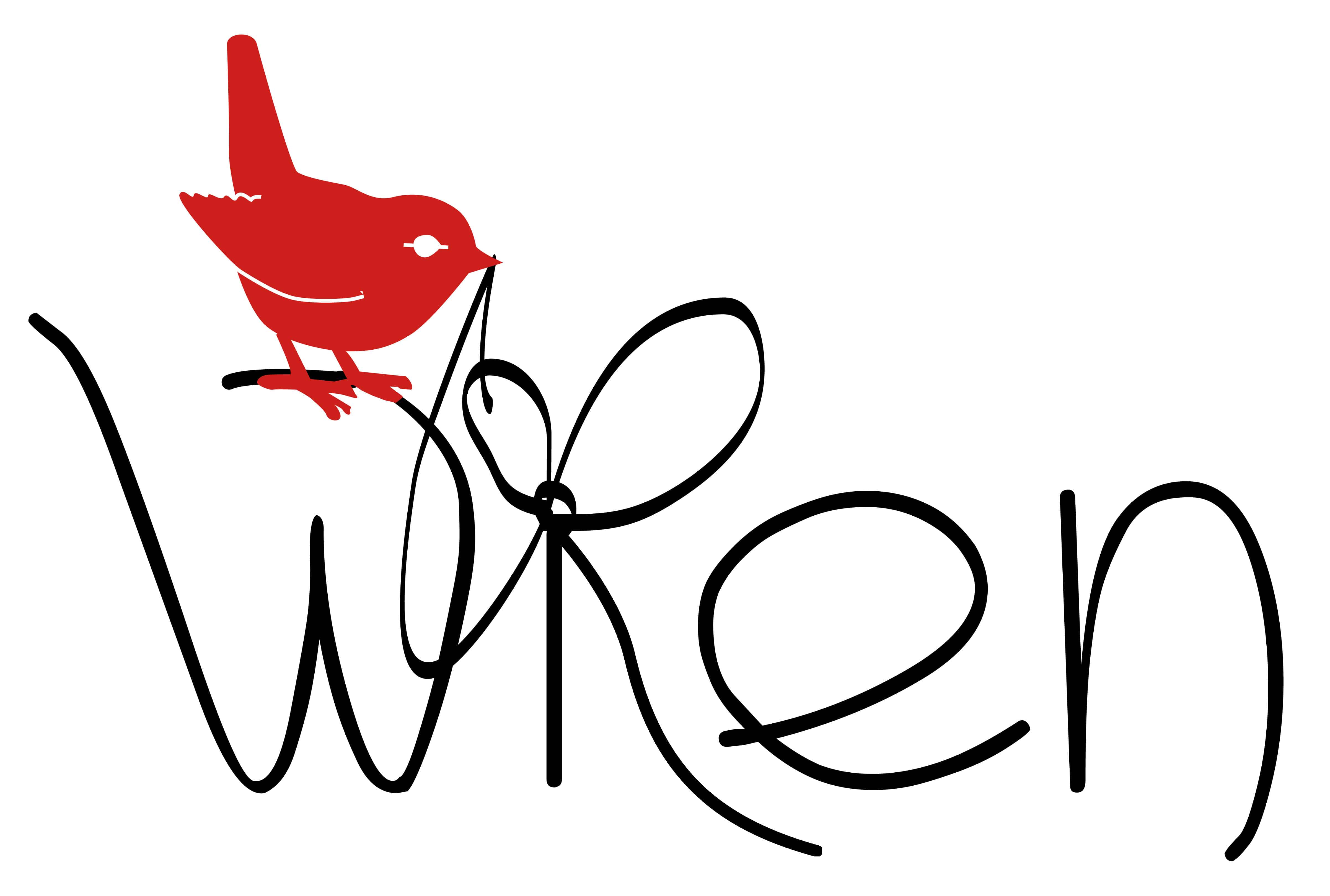 Sometime in 2007, whilst bored one day at my factory job as a Textile Designer, I drew a little bird. When I decided to resign and go on my own I attached myself to this cute drawing and named it “wren” – after all, it looked like a Wren bird and played on my name which is Wendren. It felt right and so the name of my company was born with a cursive, hand illustrated and vectorised logo. Here is a little bit more about that story.
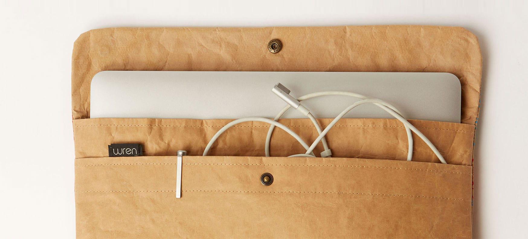
The first Wren bags were made from English woven fabrics. Later that year I started working with discarded coffee sacks found at a local roaster (read the story here). The idea of using found materials and repurposing them with the aim of promoting sustainability was a watershed moment for the company and changed it from the core (read about this change of path here). Not long after this I began to work with paper and over the next two years I developed what is perhaps our most recognisable product: The PPC Cement Laptop Bag made from paper cement packaging bags. In 2015 paper took over our production and that is now what we focus on almost solely.
In the beginning the Wren bird, with it’s flowing text and feminine quality, worked well for our product collection but our product has developed to be more than just fabric bags > they are lifestyle accessories that are designed for a specific purpose, for both men and women across many ages and in different industries. Our bags and sleeves have a strong unique design aesthetic, and are made from an innovative paper process that we have uniquely developed. We work with paper like no other company can, and in a way no other company has! Our logo no longer spoke to the product.
Together with the graphic team from Mediumrare we got to work redesigning Wren’s logo.
It was a long and careful process of elimination and refinement. I ended up working from the real Wren bird and hand drawing it (several hundred times) using grid paper.
 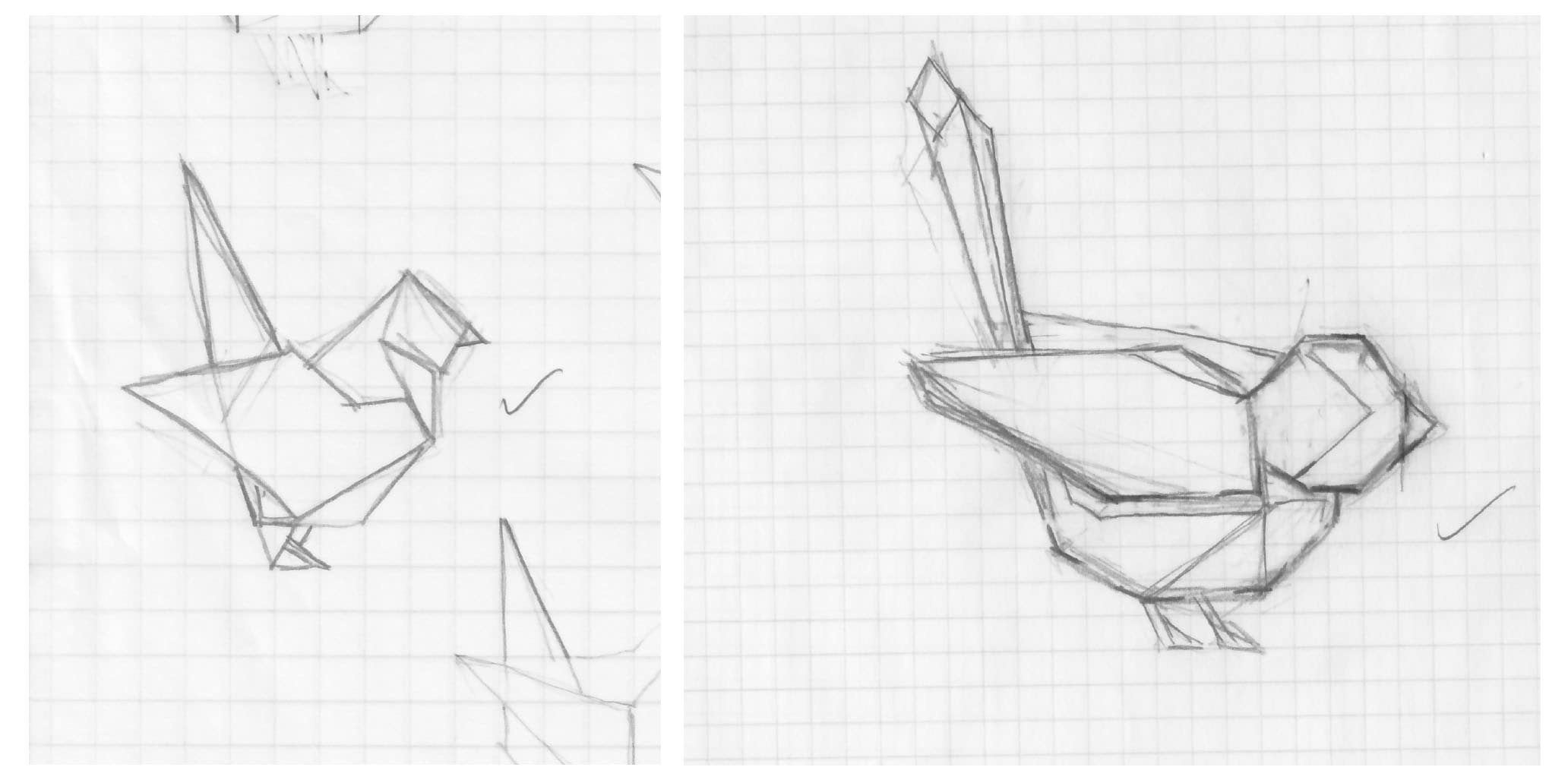 It is hard to rework a design you are so familiar with and having an outside team interpret and work magic on my hand drawn sketches was the only way it was going to change. The bird went through many phases: “it’s too angry”, “its to cutesy”. I knew it was done when I added the tight pattern to the bottom of the wing – like in the original logo. It suddenly became “our Wren”.
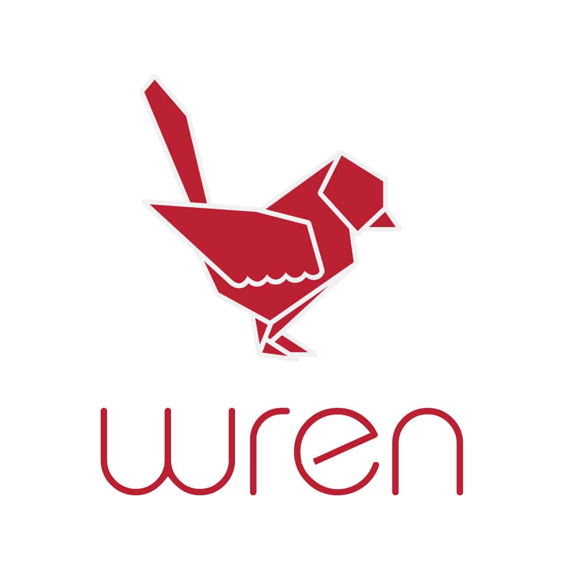 I love our new logo and am excited to see it being printed.
 Let a whole new chapter begin….
 Sometime in 2007, whilst bored one day at my factory job as a Textile Designer, I drew a little bird. When I decided to resign and go on my own I attached myself to this cute drawing and named it “wren” – after all, it looked like a Wren bird and played on my name which is Wendren. It felt right and so the name of my company was born with a cursive, hand illustrated and vectorised logo. Here is a little bit more about that story.
The first Wren bags were made from English woven fabrics. Later that year I started working with discarded coffee sacks found at a local roaster (read the story here). The idea of using found materials and repurposing them with the aim of promoting sustainability was a watershed moment for the company and changed it from the core (read about this change of path here). Not long after this I began to work with paper and over the next two years I developed what is perhaps our most recognisable product: The PPC Cement Laptop Bag made from paper cement packaging bags. In 2015 paper took over our production and that is now what we focus on almost solely.
In the beginning the Wren bird, with it’s flowing text and feminine quality, worked well for our product collection but our product has developed to be more than just fabric bags > they are lifestyle accessories that are designed for a specific purpose, for both men and women across many ages and in different industries. Our bags and sleeves have a strong unique design aesthetic, and are made from an innovative paper process that we have uniquely developed. We work with paper like no other company can, and in a way no other company has! Our logo no longer spoke to the product.
Together with the graphic team from Mediumrare we got to work redesigning Wren’s logo.
It was a long and careful process of elimination and refinement. I ended up working from the real Wren bird and hand drawing it (several hundred times) using grid paper.
  It is hard to rework a design you are so familiar with and having an outside team interpret and work magic on my hand drawn sketches was the only way it was going to change. The bird went through many phases: “it’s too angry”, “its to cutesy”. I knew it was done when I added the tight pattern to the bottom of the wing – like in the original logo. It suddenly became “our Wren”.
 I love our new logo and am excited to see it being printed.
 Let a whole new chapter begin….









Comments are closed.